

Summary
An infographic resume presents your career with charts, icons, timelines and color instead of plain text. It works when a person reads it first: design and marketing roles, networking, portfolios and interviews. It fails in online applications, because applicant tracking systems cannot read graphics. The safe approach is two versions with the same facts: a one-column ATS resume for every portal, and an infographic version for people, built only from numbers you can count.
An infographic resume shows your experience with charts, icons, timelines and color instead of plain blocks of text. It can help in design, marketing and networking, where a person sees it first. It hurts in online applications, where software reads it first and cannot read graphics.
So the real question is not whether an infographic resume is good or bad. It is who reads it first. Jobscan found that 97.4% of Fortune 500 companies use an applicant tracking system in 2026, which means most large-employer applications meet software before a recruiter.
This guide covers what an infographic resume is, where it works, where it fails, and how to pair it with a plain ATS version so you never have to choose.
What is an infographic resume?
An infographic resume is a visual resume that turns career facts into graphics: timelines for work history, charts for results, icons for contact details and color blocks for sections. It aims to be scanned in seconds. Unlike a standard resume, much of its information lives in shapes, which software cannot read.
A standard resume tells your story in lines of text. An infographic resume shows it. Common elements include:
- A visual timeline of jobs instead of a list
- Charts for results, such as revenue growth or follower counts
- Icons for phone, email, location and skills
- Skill bars or ratings showing levels
- Color blocks and columns to separate sections
The appeal is speed. Recruiters do skim fast. TheLadders' eye-tracking study measured an average initial screen of 7.4 seconds in 2018. However, that same study found the best-performing resumes had simple layouts with clear headers, while weak ones had multiple columns and little white space. Visual does not automatically mean faster to read.
For more on that first skim, see how long recruiters look at a resume.
Are infographic resumes processed faster by recruiters?
There is no good evidence for the popular claim that people process visuals 60,000 times faster than text. Researchers who traced it found no study behind it; the earliest version appears in a 1982 business magazine advertisement. Clear structure and short text help recruiters more than graphics do.
Many guides justify an infographic resume with the line that visuals are processed 60,000 times faster than text. The claim even appears in mainstream career articles.
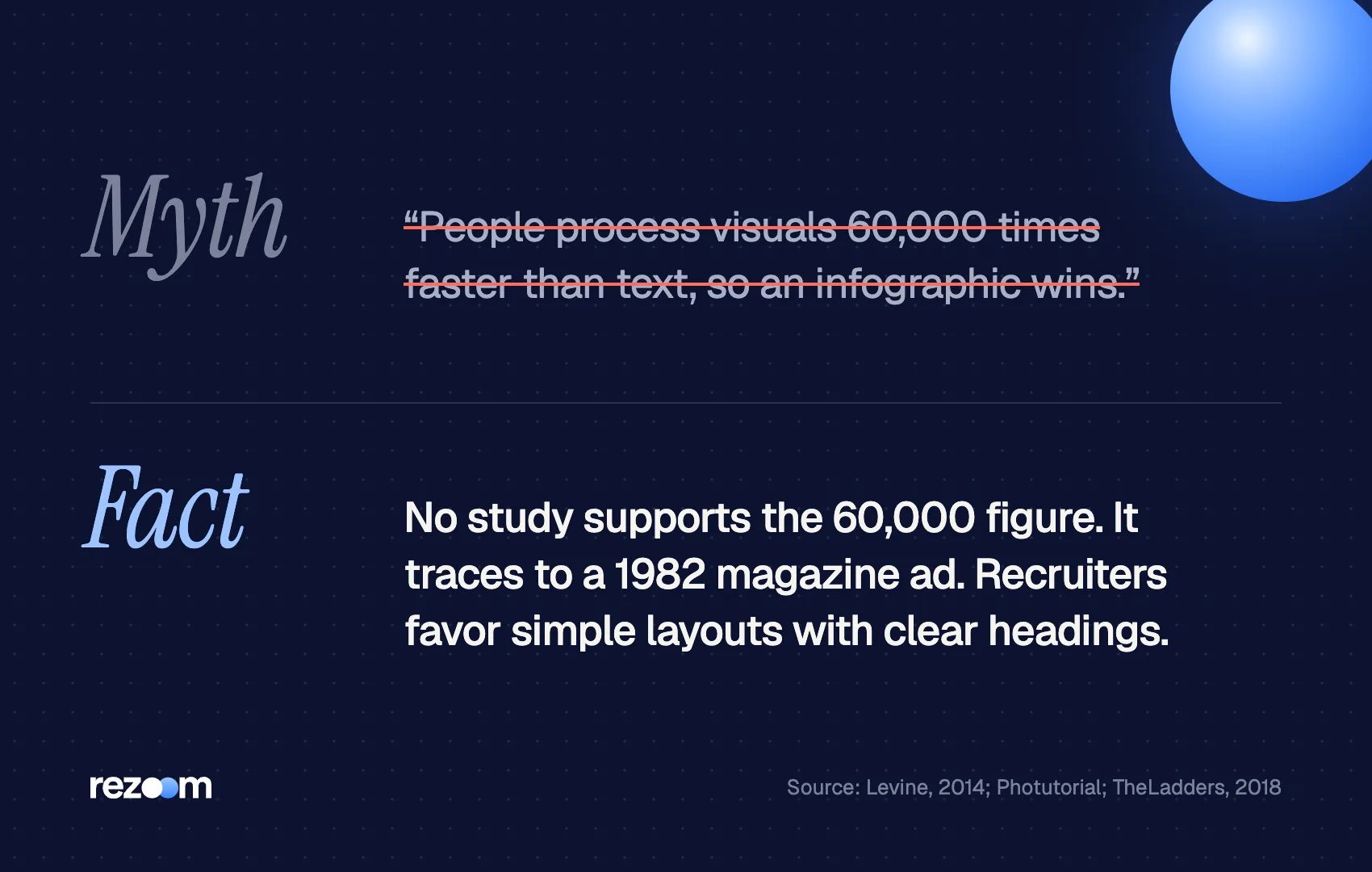
It does not hold up. Educator Alan Levine spent years trying to find the research behind it and offered a reward to anyone who could; it went unclaimed. A later review by Photutorial traced the figure to a 1982 Business Week advertising section with no research cited.
That matters for your decision. An infographic resume is not a shortcut through a recruiter's brain. It is a design sample. Use it where showing design skill is the point, and not as a general speed hack.
When does an infographic resume work?
An infographic resume works when a person reads it before any software: graphic design, marketing, advertising, UX and content roles that value visual communication, plus networking, career fairs, portfolio sites, LinkedIn featured sections, and interviews you already have. In those settings, the design itself proves a skill the job needs.
The University of Georgia Career Center says creative resumes can be necessary for positions in graphic design, advertising and interior design, while warning that not every employer will appreciate one.
Good settings for an infographic resume:
- Design and creative roles, where layout skill is part of the job
- Marketing and social media roles, where data visualization is a daily task
- Networking, such as a direct email to a hiring manager you met
- Career fairs and meetups, handed over in print
- Your portfolio site or LinkedIn Featured section, next to your work samples
- Interview day, as a leave-behind once you have passed screening
In every case, a human sees it first. For creative roles, it works best alongside real work samples. Our guide to portfolio vs resume explains how the two support each other, and how to add a portfolio link to a resume shows where the link goes.
Results at a glance, 2023–2025
Email list: 18,000 → 41,000 subscribers (bar chart)
Newsletter click rate: 2.4% → 3.9% (line chart)
Paid social budget managed: $60,000 per year (single stat)
Community events run: 11, average 220 attendees (icon row)
Every chart above shows a counted result. That is the standard to hold: if you cannot put a number on it, it does not get a chart.
When should you avoid an infographic resume?
Avoid an infographic resume for any online application through a job portal, staffing agency or large employer. Applicant tracking systems read text, not charts, icons or skill bars, and they often scramble columns. Also skip it for conservative fields such as law, finance, government and healthcare, where readers expect a traditional format.
The ATS is the main problem. Indeed's ATS guide warns that systems may not interpret text boxes, columns, headers or images, which disrupts the linear flow of a resume. An infographic resume is built almost entirely from those elements.
After parsing, a typical infographic resume loses:
- Skill levels, because bars and stars are shapes, not text
- Results in charts, unless the number is also written as text
- Contact details shown only through icons
- The order of your history, when a timeline runs sideways or across columns
Keyword matching makes the loss worse. Jobscan reports that 99.7% of recruiters use keyword filters in their ATS. A skill drawn as a bubble chart is a skill the filter cannot find. For the mechanics, read how does ATS work.
| Situation | Who reads first | Send |
|---|---|---|
| Online application or job portal | ATS software | Plain ATS resume |
| Staffing agency submission | ATS software | Plain ATS resume |
| Email to a hiring manager you know | A person | Infographic plus plain version |
| Career fair or networking event | A person | Infographic, printed |
| Portfolio site or LinkedIn Featured | A person | Infographic |
| Interview you already have | A person | Both, printed |
| Law, finance, government, healthcare | Varies | Plain ATS resume only |
Building yours in Canva? Read our sibling guide on whether a Canva resume passes ATS. The two-column resume guide covers the same parsing risk for split layouts.
How do you pair an infographic resume with an ATS version?
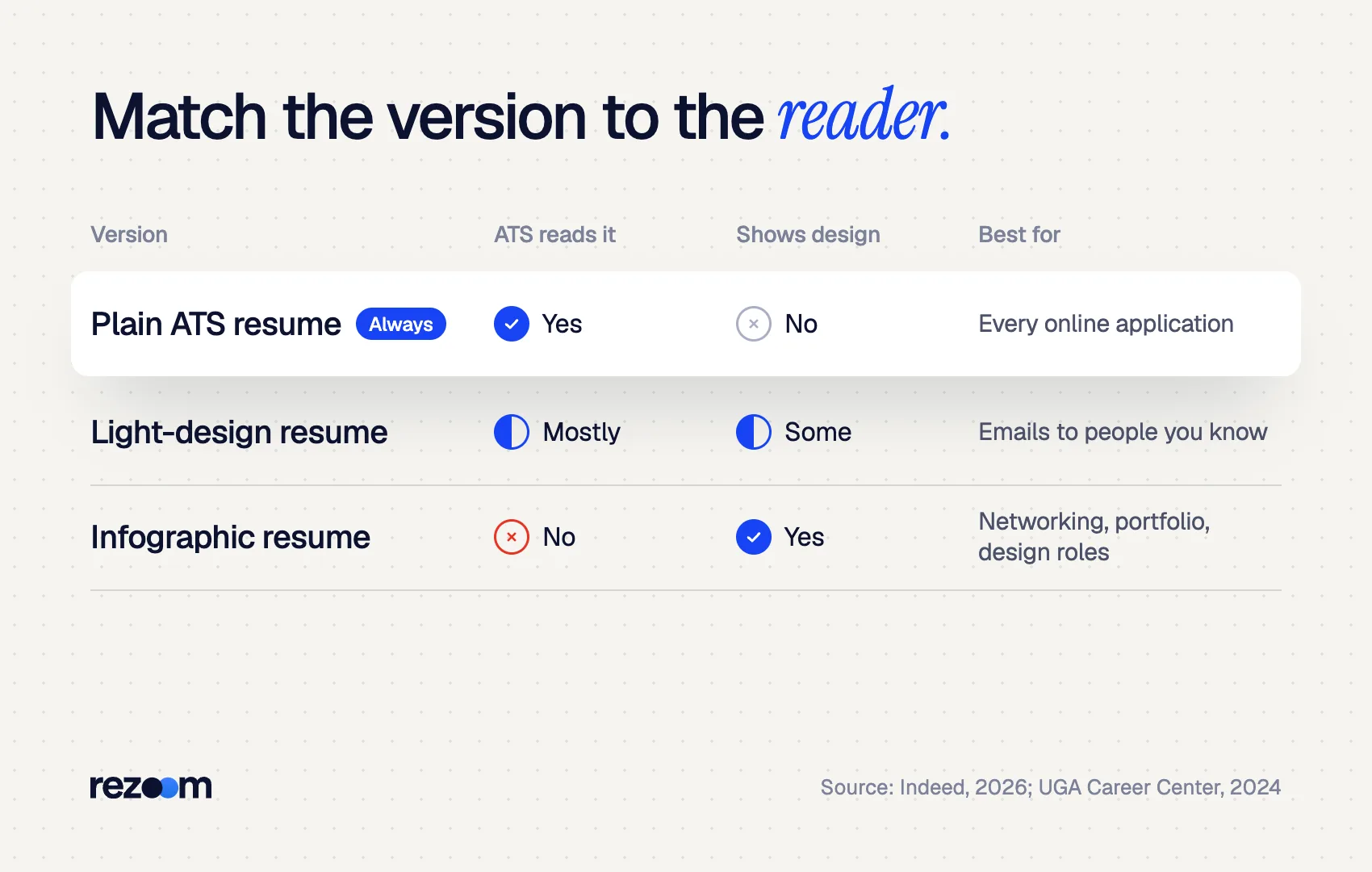
Write the plain ATS resume first, then design the infographic from it. Both versions should share the same job titles, dates, employers and numbers. Submit the plain version to every portal, and use the infographic with people. When you email, attach both, and link the infographic from your portfolio or LinkedIn profile.
Treat the plain resume as the master and the infographic resume as a designed edition of it. A middle option also exists: a light-design resume. UGA's career center notes that color, lines and shading are acceptable where text boxes, columns, tables and pictures are not. That order keeps your facts consistent, so nothing on the visual version surprises a recruiter who compares the two.
- Write the ATS version. One column, standard headings, keywords from the posting, and quantified bullets. Start from an ATS friendly resume template.
- Pick three to five numbers to chart. Choose your strongest counted results. Our guide on how to quantify your resume helps you find them.
- Design the infographic. Use one or two brand colors, readable fonts and plenty of white space. See color on a resume for restraint that still looks sharp.
- Write every key fact as text too. Put the number next to each chart and the label next to each icon.
- Name both files clearly. For example, Jordan-Lee-Resume.pdf and Jordan-Lee-Visual-Resume.pdf.
ATS version (bullet): - Grew email list from 18,000 to 41,000 subscribers in 20 months through segmented campaigns
Infographic version (chart label): Email subscribers | 18K → 41K | 20 months
The Rezoom AI resume builder gives you the clean, ATS-ready version to start from, with quantified bullets you can then turn into charts for the visual edition.
Chart only what you can count
Skip skill bars. A bar saying you are "80% at Excel" means nothing to a reader and nothing to software. Chart outcomes instead: revenue, growth, time saved, people trained. If a recruiter asks "80% of what?", the chart has failed.
What makes a good infographic resume design?
A good infographic resume stays on one page, uses one or two accent colors, keeps body text at a readable size, charts only real numbers, and leaves white space. It still has clear section headings and a scannable work history. If a reader cannot find your last job title in five seconds, simplify.
Design restraint is what separates a strong infographic resume from a cluttered one. TheLadders found that resumes with a cluttered look, multiple columns and little white space performed worst with recruiters.
Keep your name, current title and contact details as plain text at the top do: Chart three to five counted results, each with its number written out do: Use one or two accent colors and a readable font size
Rate your own skills with bars, stars or percentages dont: Add a headshot (see our guide on a photo on resume) dont: Upload the infographic to a job portal instead of your ATS version
Keep fonts readable at print size, and check our guides on best fonts for resume and resume font size. On photos, our photo on resume guide explains why US resumes usually leave them out.

Frequently asked questions
Are infographic resumes ATS friendly?
Generally no. Applicant tracking systems read text, so charts, icons, skill bars and columns are lost or scrambled. Use a plain, one-column version for online applications.
Should I send an infographic resume with my application?
Only where a person reads it first, such as an email to a hiring manager. In a job portal, upload your ATS version. If the form allows extra files, add the infographic as a portfolio sample.
Which jobs suit an infographic resume?
Graphic design, marketing, advertising, social media, UX and other creative roles where visual communication is part of the work. Conservative fields usually expect a traditional resume.
How long should an infographic resume be?
One page. Its purpose is a fast visual overview, and your full detail lives in the ATS version.
Can I make an infographic resume in Canva?
Yes. Export it as a PDF with selectable text, and keep a separate plain version for portals. Our guide to Canva resumes and ATS covers the exact export settings.
Do recruiters like infographic resumes?
It depends on the role. Creative hiring managers may value the design skill, while many recruiters prefer simple layouts that are quick to scan and easy to search.



Comments