

Summary
Color on a resume is fine when it is a single dark accent used for your name, headings and divider lines, while body text stays black. Color does not confuse an applicant tracking system, but colored text with low contrast, text inside graphics and colored paper cause real problems. Pick a shade with at least a 4.5:1 contrast ratio against white, check that it still reads in grayscale, and skip color for conservative fields like law, banking and government.
Color on a resume helps when it is one dark accent that guides the eye to your name and section headings. It hurts when it lowers contrast, carries meaning on its own, or turns a document into a design piece for a conservative employer.
So the short rule is: one dark accent color, black body text, white background. Everything else in this guide explains when to bend that rule and how to test your choice.
Most guides on this topic stop at color psychology. This one adds the parts that actually decide whether your color choice works: measured contrast ratios, a grayscale print test and the color-vision facts most designers forget.
Is it OK to use color on a resume?
Yes, in most US industries a small amount of color on a resume is acceptable. Use one dark accent for your name, headings or thin divider lines, and keep body text black on white. Avoid color in conservative fields such as law, banking and government, and never use colored paper.
Color is a navigation aid, not a selling point. Used well, it makes headings easier to find.
Santa Clara University's career center gives the simplest version of the rule: use color minimally and ensure high contrast between text and background. That advice holds for almost every job seeker.
Where color belongs on the page:
- Your name in the header
- Section headings such as Experience, Skills and Education
- Thin rule lines under headings
- Hyperlinked text for your portfolio or LinkedIn, if you send a PDF
Where it does not belong: body text, bullet text, dates, shaded boxes behind text, and skill bars. Those choices cost readability and add nothing. If you want more on what the reader does see first, read our guide on how long recruiters look at a resume.
Does color on a resume affect ATS parsing?
Color itself does not stop an applicant tracking system from reading your text. Parsers extract characters, not hues. The real ATS risks travel with colorful designs: text placed inside images, graphics or word art, text boxes, and multi-column layouts. A colored heading in a normal text line parses like black text.
An ATS turns your file into plain text. A navy heading is still the word "Experience" to the parser. The problems come from design habits that arrive with color.
Greenhouse, one of the most widely used ATS platforms, lists the formats that cause unsuccessful resume parses. They include resumes with "graphics, photos, or word art," resumes uploaded as an image, and resumes with contact details in a header, footer or text box. A colorful template built in a design tool often has all three.
This matters because ATS use is close to universal at large employers. Jobscan found 97.4% of Fortune 500 companies used a detectable ATS in 2026. For the full picture of how parsing works, see how does ATS work.
Two color mistakes do hurt ATS results:
- White or very light text used to hide keywords. Parsers read it, and a recruiter who views the parsed text sees it. It reads as a trick.
- Text inside a colored shape or image. If a skill or job title sits in a graphic, the parser may never see it.
If you like design-heavy layouts, read our sibling guides on Canva resumes and ATS and two column resumes before you apply online.
Which resume colors have enough contrast?
Choose a color with a contrast ratio of at least 4.5:1 against white, the WCAG 2.2 minimum for normal text. Navy, charcoal, burgundy, forest green and dark royal blue all clear it easily. Orange, light blue, yellow and bright green fail it, so do not use them for text on a resume.
The Web Content Accessibility Guidelines set a minimum contrast ratio of 4.5:1 for normal text. Large text, defined as at least 18 point, or 14 point bold, needs 3:1. Resumes are not websites, but the same eyes read them, often on a laptop in a bright office.
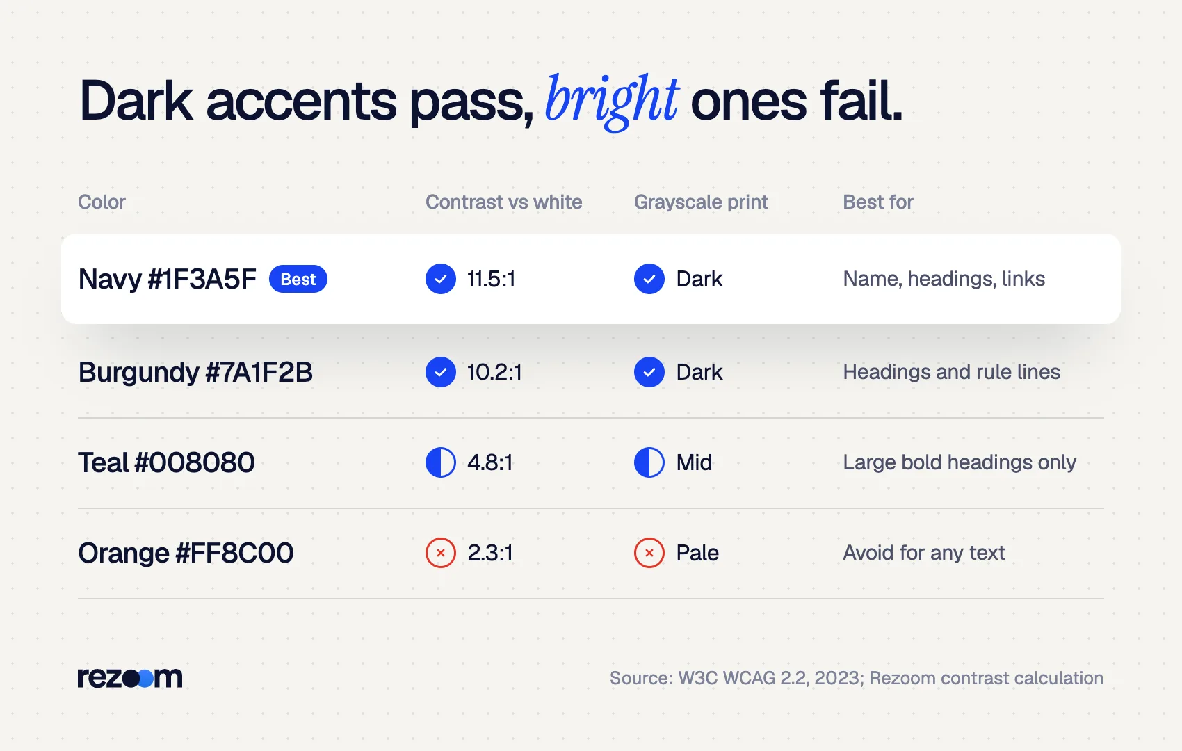
We ran common resume colors through the WCAG contrast formula against a white background. The grayscale value shows how dark each color prints on a black-and-white printer (0 is black, 255 is white).
| Color (hex) | Contrast vs. white | Passes 4.5:1? | Grayscale value | Verdict |
|---|---|---|---|---|
| Navy #1F3A5F | 11.5:1 | Yes | 54 | Best all-round accent |
| Charcoal #333333 | 12.6:1 | Yes | 51 | Safe for any industry |
| Burgundy #7A1F2B | 10.2:1 | Yes | 60 | Good for headings |
| Forest green #1E5631 | 8.6:1 | Yes | 65 | Good for headings |
| Royal blue #1F4E9C | 8.0:1 | Yes | 73 | Good for name and links |
| Teal #008080 | 4.8:1 | Barely | 90 | Headings only, bold |
| Bright red #FF0000 | 4.0:1 | No | 76 | Avoid for text |
| Medium gray #808080 | 3.9:1 | No | 128 | Avoid for body text |
| Kelly green #4CBB17 | 2.5:1 | No | 135 | Avoid |
| Orange #FF8C00 | 2.3:1 | No | 158 | Avoid |
| Light blue #6CB4EE | 2.2:1 | No | 165 | Avoid |
| Yellow #FFD700 | 1.4:1 | No | 202 | Never for text |
Navy reaches 11.5:1, more than double the 4.5:1 minimum, and orange reaches only 2.3:1. That gap is why the safest color on a resume is a dark one. Bright hues look bold on screen and faint on paper.
Teal sits right at the line. Use it only for large, bold headings, where the 3:1 large-text threshold applies. For the right sizes, see our sibling guide on resume font size.
JORDAN LEE (name in navy #1F3A5F, 22 pt bold) Denver, CO | [email protected] | linkedin.com/in/jordanlee (link in navy)
EXPERIENCE (heading in navy, 12 pt bold, thin navy rule below) Operations Coordinator | Brightway Logistics | Mar 2023 – Present (black text) - Cut average order processing time from 3.1 to 2.2 days by rebuilding the intake checklist (black text)
How does color on a resume look when printed in grayscale?
Many resumes get printed on office black-and-white printers, so every color turns into a shade of gray. Dark accents such as navy and burgundy print as near-black and stay readable. Light or bright colors such as orange, yellow and light blue print as pale gray and can almost disappear.
You do not control the printer, and office defaults are often grayscale.
In the table above, navy prints at a grayscale value of 54, close to black. Light blue prints at 165, a pale gray. Yellow prints at 202, almost white. A skill or heading in yellow is effectively invisible on a grayscale printout.
Paper matters too. Cornell's career services notes that off-white is the safest resume paper color and that many employers see colored paper as unprofessional. East Carolina University's career center goes further for art and design resumes: do not submit your resume on colored paper, and avoid colored fonts.
A quick test takes one minute:
- Open your PDF and choose Print.
- Set the printer to "Black and white" or "Grayscale."
- Look at the preview, or print one page.
- If any heading looks faint or gray, darken that color.
For layout choices that print cleanly, our guide on resume margins and spacing covers the rest of the page.
Can everyone see the color on your resume?
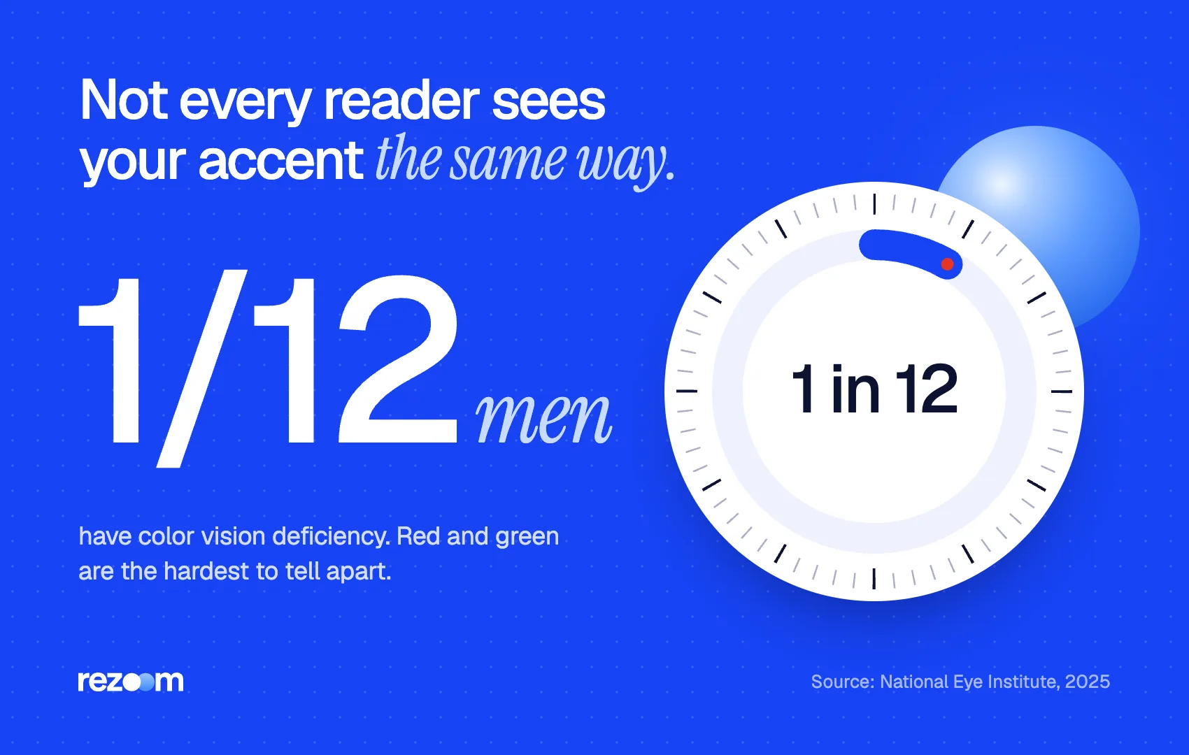
About 1 in 12 men have color vision deficiency, and the most common type makes red and green hard to tell apart, according to the National Eye Institute. Never let color carry meaning on its own. A red heading must still look like a heading through size, weight and position.
The National Eye Institute reports that about 1 in 12 men have color vision deficiency. The most common type makes it hard to tell red from green. In a hiring team of a dozen men, odds are good that at least one sees your accent differently than you do.
WCAG addresses this in its Use of Color criterion: color should not be "the only visual means of conveying information." On a resume, that means:
- Do not mark top skills in green and weaker ones in red.
- Do not show proficiency only with colored dots or bars.
- Do make headings different through bold, size and spacing, then add color.
Use one dark accent color for your name, headings and rule lines do: Keep all body text and bullets in black or charcoal do: Check every color against the 4.5:1 contrast minimum do: Print one copy in grayscale before you send it
Use color as the only way to show skill level or importance dont: Put text inside colored boxes, images or shapes dont: Hide keywords in white text dont: Print on colored or tinted paper
Which industries welcome color on a resume?
Creative, tech, marketing and startup roles usually welcome a tasteful accent and sometimes expect visual polish. Law, banking, accounting, government and academia lean conservative, so black text or a single navy or charcoal accent is safest. When unsure, match the employer's own website and job posting style.
No survey measures recruiter reactions to color by industry, so use the employer as your guide: their website, brand colors and job posting.
| Industry | Color tolerance | Safe choice |
|---|---|---|
| Graphic design, UX, creative agencies | High | One brand-like accent; show range in your portfolio |
| Marketing, communications, media | Medium to high | One accent in headings and name |
| Tech and startups | Medium | Navy, royal blue or teal headings |
| Healthcare and education | Medium to low | Navy or forest green headings |
| Finance, accounting, law, government | Low | Black, or navy name only |
| Academia (CV) | Low | Black text only |
Even design roles do not need a colorful resume. East Carolina University's design-resume guidance asks for no colored fonts and no images, because the portfolio carries the visual proof. For that link, see how to add a portfolio link to your resume. If you are tempted by a visual-heavy layout, compare it with the tradeoffs in our infographic resume guide.
Finance analyst (conservative): Name in navy #1F3A5F. Headings in black, bold, all caps. No other color.
Product designer (creative): Name and headings in burgundy #7A1F2B. Thin burgundy rule under each heading. Portfolio link in burgundy. All bullets in black.
Borrow the employer’s accent, then darken it
Find the main brand color on the company's website. If it passes 4.5:1 against white, use it for your headings. If it is a light or bright shade, pick a darker version of the same hue until it passes. The resume feels aligned with the company without sacrificing readability.
How do you add color to a resume the right way?
Pick one dark accent that passes 4.5:1 contrast. Apply it to your name, section headings and thin divider lines only. Keep body text black, background white and the layout single column. Save as a text-based PDF, run a grayscale print preview, then run the file through an ATS check before you apply.
The steps:
- Choose one accent. Navy, charcoal, burgundy or forest green are safe defaults.
- Check contrast. Paste the hex code into any WCAG contrast checker. Aim for 4.5:1 or higher.
- Apply it sparingly. Name, headings, rule lines and links. Nothing else.
- Keep the structure plain. Single column, real text, no text boxes. Our ATS friendly resume template shows the layout.
- Save correctly. Export a text-based PDF unless the posting asks for Word. See should I send my resume as a PDF or Word.
- Test. Print one page in grayscale and confirm every heading still stands out.
If you want this handled for you, the Rezoom AI resume builder uses ATS-safe templates with dark accent colors, so you can choose a color without risking readability.

Frequently asked questions
What is the best color for a resume?
Navy is the safest accent color for most resumes. It has an 11.5:1 contrast ratio against white, prints as near-black in grayscale and suits almost every industry.
Can a resume be completely black and white?
Yes. A black-and-white resume is always acceptable and is the norm in law, finance, government and academia. Recruiters judge content, not color.
Should I use colored paper for a printed resume?
No. Use white or off-white paper. Career centers such as Cornell's note that many employers see colored paper as unprofessional.
Do recruiters dislike colorful resumes?
Recruiters dislike resumes that are hard to read. A single dark accent rarely bothers anyone, while bright colors, shaded boxes and heavy graphics can slow a reader down.
Is red a bad color for a resume?
Bright red fails the 4.5:1 contrast minimum and can be hard to tell from green for people with red-green color vision deficiency. A deep burgundy works better.
How many colors should a resume have?
One accent plus black text. Two accents are the maximum, and only if both are dark and used for different elements, such as name and headings.



Comments