

Summary
Resume margins should sit at 0.75 to 1 inch, body text at 11pt, line spacing at 1.0 to 1.15, with 12 to 16 points between sections. The more useful part is the order of operations — when a resume runs long, most people shrink the layout first. Cut weak bullets, merge duplicates, remove the weakest section, and only then touch the spacing.
The mistake people make with resume margins is a sequencing error rather than a formatting one.
Your resume runs a few lines too long. So you pull the margins to 0.5 inches, drop the body text to 10pt, and tighten the spacing until it fits. It fits — and now it looks crammed before anyone reads a word.
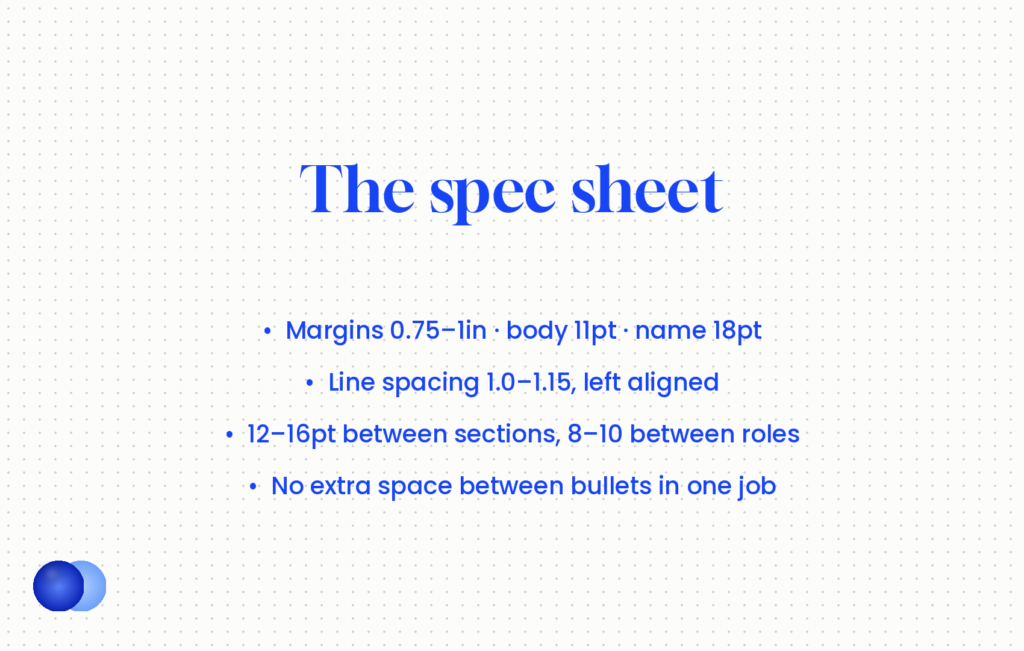
Resume margins are the last thing to change, not the first. The spec sheet below tells you where the numbers should land. The section after it tells you what to do when they will not.
What are the correct resume margins and spacing?
Margins 0.75 to 1 inch on all sides, body text 10 to 12 point with 11 as the sweet spot, line spacing 1.0 to 1.15, 12 to 16 points between sections and 8 to 10 between job entries. Never below 0.5-inch margins or 10-point type.
| Element | Standard | Floor |
|---|---|---|
| Margins, all sides | 0.75–1 inch | 0.5 inch, never lower |
| Body text | 11pt | 10pt |
| Section headings | 14–16pt | — |
| Your name | 18pt | — |
| Line spacing | 1.0–1.15 | 1.0 |
| Space between sections | 12–16pt | 10pt |
| Space between job entries | 8–10pt | 6pt |
| Space between bullets in one job | None | — |
| Alignment | Left | — |
| Fonts in the document | One, maybe two | — |
| Paper size | Letter (US), A4 (elsewhere) | — |
Two rows of that resume margins spec are worth explaining.
No space between bullets within a job. Bullets in the same role should sit tight. Extra space there wastes vertical room and blurs the boundary between roles, which is the separation that actually matters.
One font, maybe two. A single family at different sizes and weights reads as designed. Three fonts read as assembled.
Which fonts should you use?
Arial or Calibri for most roles — modern, screen-optimised, and installed everywhere. Times New Roman or Georgia for law, academia and traditional government work where a serif is expected. Nothing decorative, and nothing under 10 point.
A simple test decides it: would this company's own website use a serif font?
Modern, clean site — use a sans serif. Arial and Calibri are safe everywhere, and Calibri has been the Microsoft Office default since 2007, so it renders identically on every machine.
Traditional site, law firm, university, government department — a serif is appropriate. Times New Roman and Georgia both work.
What to avoid entirely: script and display fonts, anything under 9pt, and any text rendered as an image, which parsers cannot read at all.
Narrow the sides before the top and bottom
If you genuinely need a little more room after editing, take the left and right margins to 0.75 inch first and leave the top and bottom at 1 inch. Horizontal space is less visible to a reader than vertical space, and a page with a normal top margin still looks composed even when the sides are tighter. Pulling all four in at once is what produces the claustrophobic look.
What do you do when it runs long?
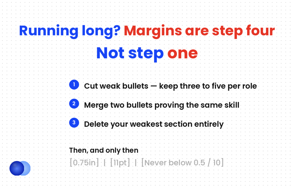
Four steps, in order. Cut weak bullets, merge duplicate achievements, delete the weakest section entirely, and only then adjust spacing. Most resumes reach the right length at step one or two and never need the layout touched.
In practice, this matters more than any number above.
1. Cut weak bullets. Every role wants three to five achievement bullets. If a role has seven or eight, the weakest two or three are diluting the strongest ones — removing them improves the resume twice over, in density and in quality.
2. Merge duplicates. Two bullets proving the same skill usually become one stronger bullet. "Managed a team of 8" and "Led weekly standups" collapse into "Led an 8-person team through weekly sprint planning, delivering 94% of quarterly objectives."
3. Cut the weakest section. If you have Skills, Certifications, Awards and Volunteering, one of those is thinner than the others. Delete it. Four strong sections beat five where one is padding.
Layout is step four
4. Only then, adjust spacing. Margins from 1 inch to 0.75, section spacing from 16pt to 12. Never below 0.5-inch margins or 10pt type.
The reason the order matters: steps one to three make the resume better as well as shorter. Step four only makes it shorter, and past a point it makes it worse.
Crammed: 0.3-inch margins, 10pt type, no space between sections, bullets packed with no breathing room. Everything fits on one page and nothing invites a reader in.
Edited: 0.75-inch margins, 11pt, 10pt between sections, 3pt between bullet groups. Two bullets cut per role and the Awards section removed. Same page count, more white space, and every remaining line earns its position.
The second one takes twenty minutes and is the version that gets read.
Do margins affect ATS parsing?
Below 0.5 inches, yes. Parsers read the PDF's text layer rather than the visual layout, but text sitting very close to a page boundary can confuse extraction. Above 0.5 inches, margins are purely a human-readability decision.
Broadly, two separate things — and only one is a parsing question.
Extremely narrow margins carry real risk. Text at the page edge can extract incorrectly, and printers clip it, which is why 0.5 inches is a floor rather than a suggestion.
Everything else about spacing is for the human. Parsers ignore white space entirely — they extract text and structure. How an ATS works covers what genuinely filters candidates, and it is vocabulary matching rather than layout aesthetics.
The formatting that does break parsing is structural rather than spatial: tables used for layout, text boxes, multi-column designs, icons and skill bars. All of them look fine to a person and scramble for a parser. An AI resume checker against a real posting shows what actually extracted from your file.
Pick one date format and use it in every entry — Jan 2023 – Mar 2026 throughout. Inconsistent dates are among the most visible signals of a document assembled in pieces.
Produce a page and a half. Either fill two full pages or cut to one — when one page still wins and when a two page resume is fine cover which applies to you.
How much white space is right?
Enough that the sections read as distinct blocks. Twelve to sixteen points between sections and eight to ten between job entries does it without horizontal rules or dividers. If your roles blur together visually, a recruiter blurs them together mentally.
Alongside resume margins, white space is the most underrated formatting tool, and the easiest to get wrong in both directions.
Too tight and the page overwhelms. A recruiter scanning two hundred resumes in an afternoon will not fight through a wall of text.
Too loose and you have wasted room that could hold a quantified achievement.
The calibration that works: each role should feel like its own block, separated clearly from the next, with the section headings clearly above the roles they contain. That is what 12–16 points between sections and 8–10 between entries produces, and it removes any need for horizontal lines or graphical dividers.
Here is where most candidates make the critical error: they have too much content for one page, so they shrink margins, reduce font size, and tighten spacing until everything fits. This is backwards.
What should you check before sending?
Print preview, screen readability, date consistency, and a plain text paste. Four checks, two minutes, and they catch almost every formatting failure that survives the edit.
1. Print preview. Confirms the margins work on paper and nothing sits at the edge.
2. Screen readability. Open it at 100% and at phone size. If the body text is hard at either, the type is too small.
3. Date consistency. One format everywhere, including the education section.
4. Copy and paste into a plain text editor. What you get is roughly what a parser extracts. If the order scrambles, the layout is the problem — the same test that decides whether to send PDF or Word, where the file format matters far less than the structure inside it.
Frequently asked questions
What margins should a resume have?
Between 0.75 and 1 inch on all four sides. Half an inch is the absolute floor — below that, text can clip in print and confuse extraction.
What font size should a resume be?
Eleven point for body text, with 10 to 12 as the acceptable range. Section headings sit at 14 to 16 and your name at around 18. Never drop below 10 point.
What line spacing should a resume use?
Between 1.0 and 1.15, with 12 to 16 points between sections and 8 to 10 between job entries. Bullets within the same role need no extra space.
What is the best font for a resume?
Arial or Calibri for most roles. Times New Roman or Georgia for law, academia and traditional government work. Nothing decorative, and never text rendered as an image.
My resume is slightly too long — should I shrink the margins?
Not first. Cut weak bullets, merge duplicate achievements, and delete your weakest section. Adjust spacing only after those, and never below 0.5-inch margins or 10-point type.
Do resume margins affect ATS parsing?
Below 0.5 inches they can, because text at the page boundary may extract incorrectly. Above that, margins and spacing are purely about human readability.
How many fonts should a resume use?
One, or two at most. A single family at different sizes and weights reads as designed, while three fonts read as assembled from pieces.
What paper size should a resume use?
Letter (8.5 × 11 inches) for US applications and A4 for most of the rest of the world. The difference is small but visible when printed.



Comments