

Summary
Use 10 to 12 point for resume body text, 12 to 14 point for section headings and 14 to 18 point for your name. University career centers agree on the 10 to 12 point body range. The exact number depends on the font: Arial and Verdana look large, so 10.5 to 11 pt is enough, while Garamond and Times New Roman look small and need 11.5 to 12 pt. Never shrink below 10 pt to fit one page; trim content or spacing instead.
The best resume font size is 10 to 12 point for body text, 12 to 14 point for section headings and 14 to 18 point for your name. Most people land on 11 pt body text, 14 pt headings and 18 pt for the name.
That range is not a matter of taste. Career centers such as West Texas A&M and Bryn Mawr set the same rule: no smaller than 10 pt and no larger than 12 pt for the body.
The detail most guides skip is that 11 pt is not the same size in every font. Below you will find sizes per section, sizes per font, and what to do when your resume runs onto a second page.
What is the best resume font size?
Use 10 to 12 point for body text, with 11 pt as the safe default. Set section headings at 12 to 14 pt and your name at 14 to 18 pt. Keep one font family and create hierarchy with size and bold, not with extra fonts or colors.
Every career center source we checked lands on the same body range. West Texas A&M advises no larger than 12 pt and no smaller than 10 pt for the body, 14 pt for section titles, and 16 to 18 pt for your name. Texas A&M's career center suggests 14 to 16 pt for the name, bolded, and 10.5 to 12 pt for everything else.
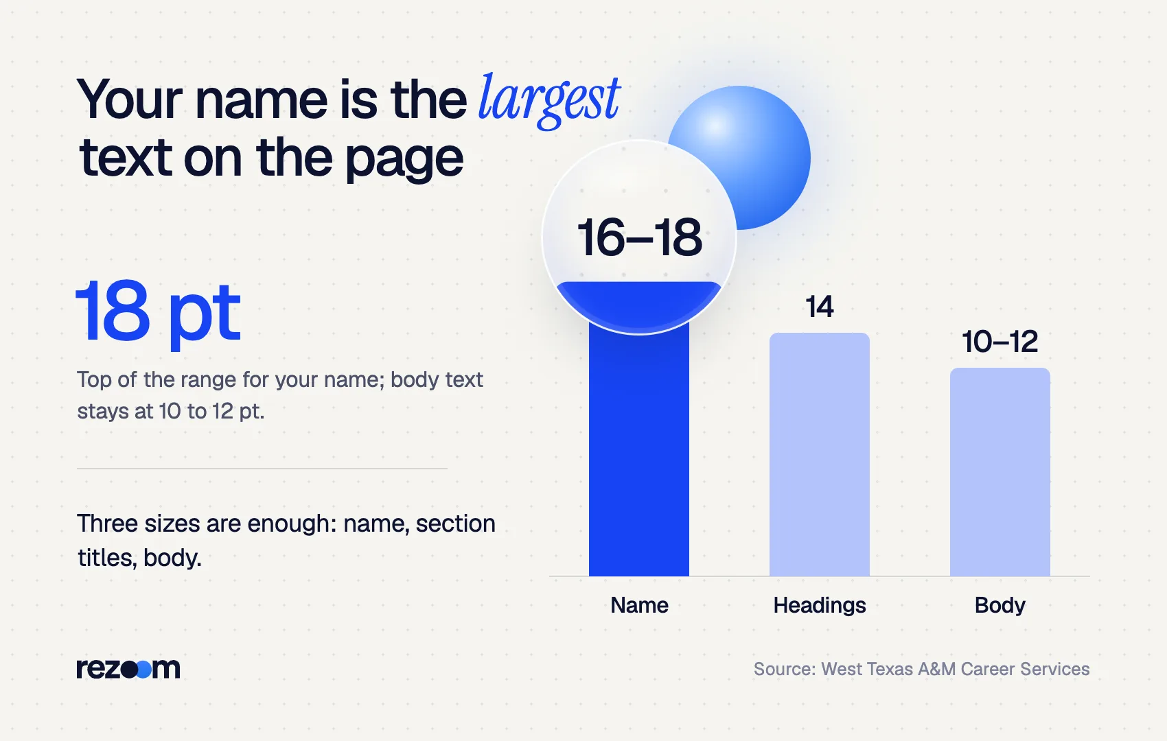
So the rule is simple: the name is the largest text, at 14 to 18 pt, headings sit in between, and body text stays inside 10 to 12 pt.
Why 11 pt as the default? It sits in the middle of the range. It was also the default size of Calibri, the font Microsoft Office used for years before switching to Aptos, as The Register reported. Recruiters have read millions of documents at that size, so it looks normal.
What resume font size should each section use?
Name 14 to 18 pt bold. Section headings 12 to 14 pt bold or small caps. Job titles and employer names the same size as the body, in bold. Body text and bullets 10 to 12 pt. Contact line and dates the same as the body or one point smaller, never below 9 pt.
A resume needs only three or four sizes. More than that looks busy and makes the hierarchy harder to read.
| Resume element | Size range | Recommended | Style |
|---|---|---|---|
| Your name | 14–18 pt | 18 pt | Bold |
| Section headings | 12–14 pt | 13 or 14 pt | Bold or small caps |
| Job titles, employer names | 10–12 pt | Same as body | Bold for one, regular for the other |
| Body text and bullets | 10–12 pt | 11 pt | Regular |
| Contact line, dates | 9–11 pt | Body size or 1 pt smaller | Regular |
Texas A&M's guide notes that section titles and company names are usually bolded, with job titles often italicized. That gives you hierarchy without adding sizes.
SAM CARTER (18 pt, bold) Columbus, OH | (614) 555-0192 | [email protected] (10 pt)
EXPERIENCE (13 pt, bold) Logistics Coordinator | Midwest Freight Co. | 2022 – Present (11 pt, title bold) - Scheduled 120+ weekly shipments across 14 carriers with 98% on-time delivery (11 pt)
What resume font size works best for each font?
Fonts differ in how big they look at the same point size. Wide fonts like Arial, Helvetica and Verdana read well at 10 to 11 pt. Compact fonts like Calibri, Times New Roman and Garamond need 11 to 12 pt. Print one line at your chosen size and compare before deciding.
Point size measures the full height of the type block, not the visible letters. Fonts with tall lowercase letters, like Verdana, look much bigger than fonts with short lowercase letters, like Garamond, at the same setting.
Use this table as a starting point. If you are still choosing a typeface, our guide to the best fonts for a resume compares them in detail.
| Font | Looks | Body size | Heading size | Name size |
|---|---|---|---|---|
| Arial | Large, wide | 10.5–11 pt | 13–14 pt | 16–18 pt |
| Helvetica | Large, wide | 10.5–11 pt | 13–14 pt | 16–18 pt |
| Verdana | Very large | 10 pt | 12–13 pt | 16 pt |
| Calibri | Compact | 11–12 pt | 13–14 pt | 18 pt |
| Aptos | Medium | 11 pt | 13–14 pt | 18 pt |
| Georgia | Large serif | 10.5–11 pt | 13–14 pt | 16–18 pt |
| Times New Roman | Compact serif | 11.5–12 pt | 14 pt | 18 pt |
| Garamond | Small serif | 12 pt | 14 pt | 18 pt |
These are working ranges, not laws. The test that matters is how the page looks printed at 100% and on a laptop screen.
- Arial 10.5 pt: Reduced invoice errors 32% by building a shared Excel checklist
- Times New Roman 12 pt: Reduced invoice errors 32% by building a shared Excel checklist
- Garamond 12 pt: Reduced invoice errors 32% by building a shared Excel checklist
All three lines take up roughly the same visual space on the page, even though the point sizes differ.
Is 10 point too small for a resume font size?
Ten point is the smallest acceptable resume font size, and it only works in large fonts like Arial, Helvetica or Verdana. In Times New Roman, Garamond or Calibri, 10 pt looks cramped. Anything under 10 pt for body text reads as an attempt to squeeze in content.
Both West Texas A&M and Bryn Mawr set 10 pt as the floor for body text. Bryn Mawr's checklist phrases it as no smaller than 10 pt and no bigger than 12 pt, with only your name and section headers allowed to go larger.
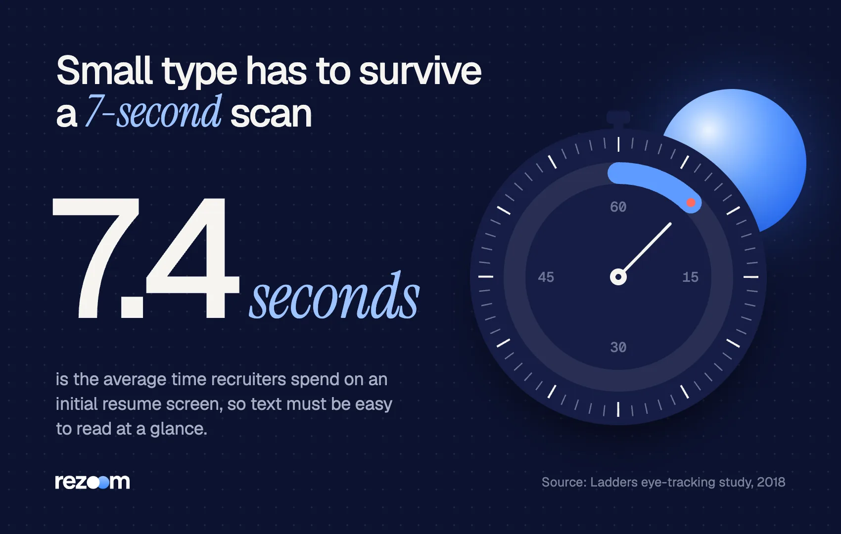
Readers skim fast. The Ladders eye-tracking study found recruiters spend an average of 7.4 seconds on an initial resume screen. Small, dense text makes that scan harder, and the top performers in the study used clear fonts and plenty of white space.
Twelve point is the ceiling. Above that, body text looks oversized and wastes the space you need for results.
Should you shrink the resume font size to fit one page?
Not below 10 pt. Before touching the resume font size, cut weak bullets, merge short sections, and tighten margins and line spacing within normal limits. Only drop the font half a point at a time, and stop at 10.5 pt for compact fonts.
Shrinking the font is the most common one-page shortcut, and the easiest for a reader to spot. Work through this order instead:
- Cut content. Remove bullets that describe duties rather than results, and jobs older than 10 to 15 years if they add nothing.
- Tighten spacing. Margins can go down to 0.5 to 0.75 inch, and line spacing to 1.0. Our resume margins and spacing guide gives the exact settings.
- Merge sections. Combine certifications and training, or move short skill lists onto one line.
- Then adjust size. Drop body text by 0.5 pt at most, and keep it at 10 pt or above.
If it still does not fit, the resume may simply deserve two pages. Our guides on the one-page resume and the two-page resume explain when each makes sense.
Keep body text between 10 and 12 pt, with 11 pt as the default do: Use one font family and create hierarchy with bold and size do: Make your name the largest text on the page do: Check the printed page at 100% before sending
Drop below 10 pt to squeeze onto one page dont: Use five or six different sizes across the document dont: Set section headings smaller than or equal to your body text
Change sizes with styles, not by hand
In Word or Google Docs, set your sizes in the Normal, Heading 1 and Heading 2 styles instead of formatting each line. Then one change updates every heading at once, and you never end up with one bullet at 10.5 pt and the rest at 11 pt.
Does resume font size affect applicant tracking systems?
An applicant tracking system reads the text, not its size, so any standard size from 10 to 12 pt parses fine. Problems come from unusual fonts, text inside images or text boxes, and tiny white text. Size matters more for the recruiter who reads the parsed resume next.
Size alone will not get you filtered out. What breaks parsing is layout: graphics, tables, headers and footers, and text boxes. Our explainer on how ATS software works covers what the software actually reads, and the ATS-friendly resume template shows a safe layout.
Readability still counts once a person opens the file. The Ladders study found that resumes with simple layouts, clear section headers and bold titles performed best in a 7.4-second scan. Clear size steps between name, headings and body text are what create those visual anchors.
If you would rather not set sizes by hand, the Rezoom AI resume builder applies a tested type hierarchy for you and exports a clean PDF. Color choices follow similar rules; see color on a resume.

Frequently asked questions
Is 11 or 12 point font better for a resume?
Eleven point suits most sans-serif fonts like Calibri, Aptos and Arial. Twelve point suits compact serif fonts like Times New Roman and Garamond. Both are within the 10 to 12 pt range career centers recommend.
What font size should my name be on a resume?
Use 14 to 18 pt, in bold. Your name should be the largest text on the page, and 18 pt is the most common choice.
What size should resume section headings be?
Use 12 to 14 pt, in bold or small caps. Headings should be one to three points larger than your body text.
Can I use 9 point font on a resume?
Not for body text. Nine point is below the 10 pt minimum and hard to read. At most, use it for a footnote-style line such as a portfolio URL.
What font size should a cover letter use?
Use the same font and body size as your resume, usually 11 or 12 pt. Matching both documents makes your application look consistent.
Does font size change when I save as PDF?
No. A PDF keeps the exact sizes you set. Check that your fonts are embedded so the recruiter sees the same type you chose.



Comments