
Summary
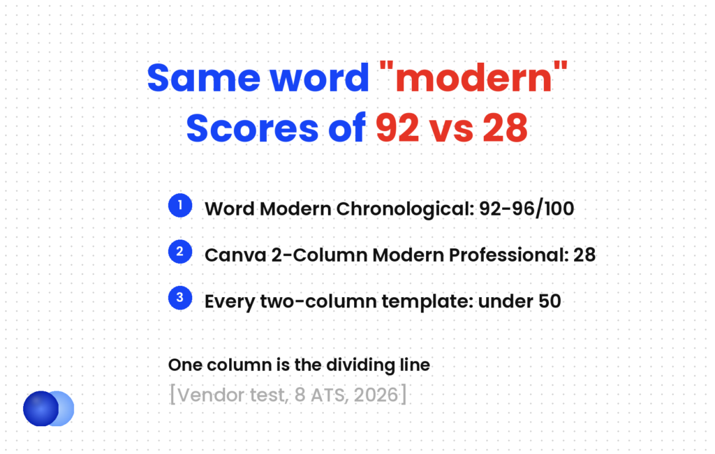
"Modern" means two different things on template sites. In one 2026 parser test, a Canva template called "2-Column Modern Professional" scored 28/100 while Word's "Modern Chronological" scored 92–96. The first is modern graphics; the second is modern typography. A modern resume template that works keeps one column, uses a clean font pairing, 11pt body text, 0.75–1in margins and a single accent colour on headings, and adds nothing a parser or a seven-second scan has to work around.
A modern resume template can score 92 out of 100 or 28 out of 100 in the same parser test, and the word "modern" sits in the name of both. That is two definitions sharing one label.
In one 2026 test across eight applicant tracking systems, Microsoft Word's "Modern Chronological" template scored 92–96. Canva's "2-Column Modern Professional" scored 28. The first treats modern as typography: a clean sans-serif, generous spacing, clear hierarchy. The second treats modern as graphics: a sidebar, skill bars, icons.
This article takes the first definition and turns it into twelve concrete designs, each specified down to the font pairing, the point sizes and where the accent colour goes. Every one of them stays in a single column and parses.
What makes a modern resume template actually modern?
Typography, spacing and hierarchy — not layout tricks. A modern resume template uses a clean typeface, 11pt body text, clear section headings, one restrained accent colour and plenty of white space, all in a single column. Sidebars, skill bars and icons look contemporary on a thumbnail and scramble the text an ATS extracts.
A dated resume uses Times New Roman, centred text, underlined headings and cramped margins. The modern version changes the type, not the structure.
What changed: sans-serif or contemporary serif faces, left alignment, headings set in small caps or bold rather than underlined, more space between sections, and one colour used sparingly.
What stayed the same: one column, reverse-chronological or hybrid order, standard section names, real text rather than graphics. The resume format types guide covers why chronological and hybrid parse at 92–97% and functional layouts do not.
Readers reward the same thing. The Ladders eye-tracking study found that top-performing resumes had "simple layouts, with clear sections and heading titles", while the weakest had cluttered layouts, little white space and multiple columns. Recruiter and parser want the same page.
Why do so many "modern" templates fail ATS?
That vendor test ran the same content through Workday, Greenhouse, Lever, Taleo, iCIMS, SuccessFactors, BambooHR and Jobvite. Treat the scores as one vendor's benchmark; the pattern is what matters.
| Template | Layout | Score (out of 100) |
|---|---|---|
| Microsoft Word "Modern Chronological" | Single column | 92–96 |
| Canva "Clean Minimal" | Single column | 82–88 |
| Enhancv "Double Column" | Two columns | 38 |
| Resume.io "Cubic" | Two columns, sidebar | 34 |
| Canva "2-Column Modern Professional" | Two columns, sidebar | 28 |
The dividing line is the column count, not the tool. Even Canva produced a passing template once the design stayed in one column.
The same vendor's separate layout benchmark changed only structure while holding content constant. The single-column control scored 100; the two-column version was the only one of six layouts to trigger a critical flag, because the reading order came out scrambled. That matches the site's position that two-column layouts break extraction regardless of file type.
File type is the smaller variable here. A text-based PDF of a single-column design parses fine; an image-based PDF fails completely, however clean it looks. The PDF or Word question matters far less than the layout inside the file.
What rules do all 12 designs share?
Seven fixed specifications: one column, 0.75–1 inch margins, 11pt body text, dates written as "Mar 2021 – Jun 2024", contact details in the body rather than a page header, standard section names, and at most one accent colour. The designs vary only in fonts, sizes and accent placement.
One column. Dates may sit right-aligned on the same line as a job title, set with a right tab stop. Never use a table or text box to do it.
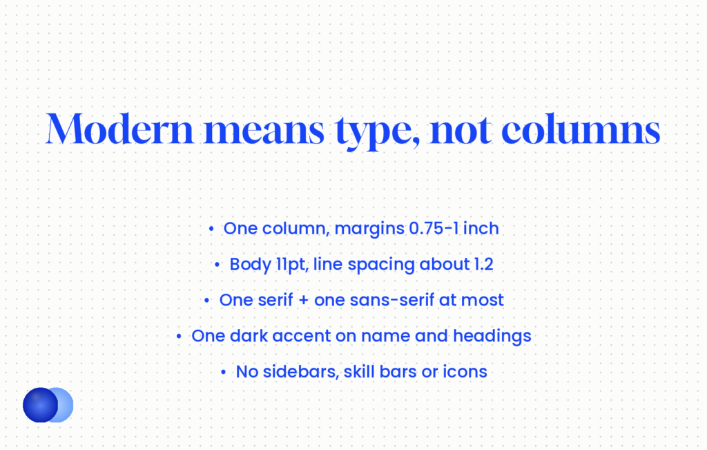
Margins 0.75–1 inch, body 11pt. Never below 0.5 inch or 10pt. If the content overflows, cut a bullet before you shrink anything. The resume margins guide explains why.
Month-and-year dates. "Mar 2021 – Jun 2024", never "2021–2024". Year-only ranges fail on several major parsers.
Contact line in the body. The same test flagged contact details placed in the page header or footer. Put name, phone, email, city and LinkedIn URL in ordinary text at the top of the page.
Standard headings. Summary, Experience, Education, Skills. "Where I've Been" is a design choice a parser cannot map.
Line spacing 1.15–1.3. Butterick's Practical Typography puts comfortable body spacing at 120–145% of the point size; 1.2 at 11pt lands inside that band.
One accent colour, dark enough to print. Navy, deep teal, oxblood or charcoal. If it disappears on a greyscale printout, it is too light.
Which modern resume template designs parse cleanly?
Twelve single-column specifications, grouped by tone. Each lists the font pairing, the name, heading and body sizes, and exactly where the accent goes. All use 11pt body text and 0.75–1 inch margins, so any of them can be built in Word, Google Docs or a resume builder.
| # | Design | Fonts (headings / body) | Name / headings / body | Accent use |
|---|---|---|---|---|
| 1 | Swiss | Arial / Arial | 24 / 11 caps / 11 | None; black only |
| 2 | Navy Line | Calibri / Calibri | 22 / 12 / 11 | Navy name and headings |
| 3 | Editorial | Georgia / Calibri | 26 / 13 / 11 | Charcoal headings |
| 4 | Aptos Clean | Aptos / Aptos | 24 / 12 bold / 11 | Deep teal name only |
| 5 | Hairline | Cambria / Calibri | 22 / 12 / 11 | 0.5pt rule under headings |
| 6 | Left Anchor | Helvetica / Helvetica | 26 / 11 caps / 11 | Navy name |
| 7 | Garamond Modern | Garamond / Garamond | 24 / 13 / 11.5–12 | Oxblood headings |
| 8 | Weight Only | Calibri / Calibri | 24 bold / 12 semibold / 11 | None; weight does the work |
| 9 | Grey Dates | Arial / Arial | 22 / 12 / 11 | Dates in dark grey |
| 10 | Top Rule | Calibri / Calibri | 22 / 12 / 11 | 2pt coloured rule above name |
| 11 | All-Serif | Georgia / Georgia | 22 / 12 / 11 | Navy headings |
| 12 | Graduate | Calibri / Calibri | 20 / 12 / 11 | Teal headings, one page |
Neutral designs (1, 6, 8, 9)
1. Swiss. Everything flush left in Arial or Helvetica. Headings in 11pt capitals with slight letter spacing, a line of space above each. No colour at all. It suits finance and operations.
6. Left Anchor. The name sits flush left at 26pt with the contact line directly beneath it in 10pt, separated by pipes rather than icons. Left alignment matches the F-pattern the Ladders study describes, so the eye starts where the name is.
8. Weight Only. One typeface, three weights. Hierarchy comes entirely from bold and semibold.
9. Grey Dates. Job title in bold on the left, dates right-aligned in dark grey on the same line via a tab stop. The grey pushes dates back so titles and employers read first.
Accent designs (2, 4, 5, 10)
2. Navy Line. Calibri throughout, name and section headings in navy (#1F3A5F), everything else black.
4. Aptos Clean. Microsoft named Aptos as the new Office default font in 2023, so it reads as current without looking designed. Colour touches only the name.
5. Hairline. A 0.5pt rule runs full width under each heading, applied as a paragraph border rather than a drawn shape.
10. Top Rule. A single 2pt coloured rule above the name, again a paragraph border.
Serif and early-career designs (3, 7, 11, 12)
3. Editorial. Georgia for the name and headings, Calibri for body text. The serif-sans pairing gives contrast without a second colour, useful for writing, marketing and communications roles.
7. Garamond Modern. Garamond sets smaller than Calibri at the same point size, so 11.5–12pt body reads like 11pt elsewhere. Oxblood headings. It suits law, publishing and academia.
11. All-Serif. Georgia throughout, built for screen reading, with navy headings.
12. Graduate. One page, education above experience, a skills line written as comma-separated text. One page is right for students and new graduates; it does not contradict the two-page preference for experienced candidates.
What should a modern design never include?
Anything a parser reads as an image, a table cell or a page header: two columns, sidebars, skill bars or star ratings, icons in the contact line, text boxes, and contact details in the header or footer. Each one looks modern on a thumbnail and costs you data in extraction.
The vendor test flagged each of these. Here is the typographic replacement.
Sidebars and two columns. The sidebar text gets interleaved into your job history. Replace with a single Skills section below Experience.
Skill bars and star ratings. A bar showing "Python ████░" carries no text a parser can read, and "four out of five" means nothing to a human. Write "Python (pandas, scikit-learn), 5 years" instead.
Icons in the contact line. A phone glyph is an image or a symbol-font character. Write the number as text.
Text boxes and tables for layout. Both can pull content out of reading order. Use tab stops and paragraph spacing.
Photos. A separate question with its own rules, starting with the posting's instructions; see photo on resume.
How to check a design before you send it
Run the copy-paste test before you apply
Open your exported PDF, select all, and paste into a plain text editor. If the text comes out in the order you wrote it — name, contact line, summary, then each job with its dates — a parser will most likely read it the same way. If a skills list appears in the middle of a job, or dates land at the bottom, you have a hidden table or column. If nothing pastes at all, you exported an image, and no parser can read it.
Graphic modern: a teal sidebar holding contact details, a photo, five skill bars and a "Languages" star rating; the work history in a right-hand column at 9.5pt to fit. In the vendor test, this style scored 28–38 out of 100.
Typographic modern (design 2, Navy Line): name at 22pt navy, contact line in 10pt with pipe separators, headings at 12pt navy, body at 11pt black with 1-inch margins, skills as one text line: "SQL, Tableau, Python (pandas), stakeholder reporting". The equivalent single-column template scored 92–96.
How do you choose between the 12 designs?
Match the tone to the industry, then pick the design whose most important element is your strongest one. Conservative fields suit neutral or serif designs; creative and tech roles can carry one accent colour. Length and content matter more than which of the twelve you pick.
Industry tone. Law, finance and government: designs 1, 7, 8 or 11. Tech, product and marketing: 2, 4, 5 or 10. Writing and communications: 3.
What you want read first. If your titles are strong, use design 9, which pushes dates back. If education leads, use design 12.
How the design survives a scan. Recruiters spent an average of 7.4 seconds on an initial scan in the Ladders study, so page one must stand alone; how long recruiters look at a resume covers what that scan reaches. A modern resume template earns its place by making the top third of page one easy to read, not by decorating it.
Build hierarchy with size, weight and space.
Download a modern resume template for its sidebar and skill bars, then try to make it parse; start from a single-column design instead.
Resumes organized by E- or F-pattern reading tendencies also did well, especially when they utilized bold titles and bulleted accomplishments.
What can a modern resume template not fix?
The content. A clean design gets your resume extracted accurately and read quickly, but it cannot make weak bullets persuasive or add keywords you left out. Design removes friction; evidence wins interviews. Keep the resume under about 600 words, whichever design you choose.
Typography is the cheapest resume improvement, and it has a ceiling: once the page parses and scans cleanly, a better font adds nothing. TalentWorks' analysis of 6,000 applications found that resumes over 600 words drew fewer hires, and no modern resume template changes that arithmetic.
So pick one of the twelve in ten minutes and spend the rest of the hour on the bullets. If you would rather not set tab stops and paragraph borders by hand, the Rezoom resume builder starts from a single-column, parser-safe layout, so the only decisions left are the ones that matter: what you did and what it achieved.
Frequently asked questions
What is a modern resume template?
A resume layout that looks current through typography and spacing — a clean font, 11pt body text, clear headings and one accent colour — while staying in a single column.
Are modern resume templates ATS-friendly?
Single-column ones are. In one 2026 vendor test, Word's "Modern Chronological" scored 92–96 out of 100, while two-column "modern" templates with sidebars scored between 28 and 38.
Can a modern resume have two columns?
No. Parsers rebuild side-by-side columns row by row and interleave the sidebar into your work history.
What font should a modern resume use?
Calibri, Aptos, Arial, Helvetica, Georgia, Cambria or Garamond all parse reliably. Pair one serif with one sans-serif at most, and keep body text at 11pt.
Is colour allowed on a modern resume?
Yes, one accent colour on the name and headings. Leave body text black.
Are skill bars bad on a resume?
Yes. They carry no text a parser can read and tell a recruiter nothing measurable.
What margins should a modern resume template use?
Between 0.75 and 1 inch, never below 0.5 inch.
Should a modern resume be a PDF or Word file?
Either works if it contains real text. A text-based PDF parses fine; an image-based PDF fails completely. Layout matters far more than file type.
Comments